
How do you deliver the index?
In this four-part series, CreditorWatch Software Architect Developer, Juanjo Lainez Reche, takes you through the decision-making and development of the Business Risk Index – one of the most complex and ambitious projects ever undertaken by the company.
In my first article I outlined how we built the master datasets and our online transaction processing platform (OLTP), which fuels most of the CreditorWatch’s website and platform. The second piece covered how we architected and built our online analytical processing platform (OLAP) and the steps we took to be able to process a vast amount of data in a small timeframe.
In the third article, we saw how we built the model, what data was in it and some of the algorithms and design patterns that we chose to be able to process such a vast amount of information in a timely manner.
In this last article, we’ll explore what processes and technologies we used to visualise the result of the index so information could be extracted easily and quickly. Data visualisation is extremely important to be able to digest lots of complex information. In our case, we chose the use of interactive maps, interactive heatmaps and tables.
Even though the cost and complexity, in terms of implementation, was greater than static graphs, it was instrumental that data consumers had the best experience possible and were able to understand and extract knowledge from this index.
The Business Risk Index, being the first of its kind, can’t rely on knowledge that the consumer might already have (architects would quite easily read and understand blueprints because they’ve spent considerable time designing and reading others), so the visualisation, the interaction and the language had to be designed so all users could get the message fast.
In more technical terms, we had to design the website so it could absorb the big peaks in traffic that happen on complex data release days, on every second Wednesday of the month, but not to be costly when there was not much traffic.
The whole delivery of BRI is basically a pipeline.
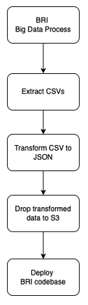
Source: CreditorWatch
The first step (BRI Data Process) was been covered in Parts two and three of this series. Once we have the datasets ready, we need to extract the information of interest. In this case, we perform a few SQL queries in our dataset that reside in our Data Lake (S3) to extract the data in CSV.
All the steps drop files in S3, so the process remains stateless. This means that no local files are passed from step to step, making each step stateless. So, if for some reason our pipeline server (we use Jenkins + Blue Ocean) went down or offline and needed to be restarted or recreated, we would be able to take the initiative and restart the pipeline from the last failing step. This principle might not be relevant with small steps, but would save hours of reprocessing on longer tasks and continue a steady workflow.
The CSV data that we extract is already the index, but in raw data, so it can’t be consumed that easily yet. The next step is to combine data from ABS1 (SA3 names and others) to create a series of JSON files that have all the information that the interface and graphs might need. These JSON files implement the signature that the front-end will follow.
The JSON files are then uploaded to S3, where they are picked up by the deployment job. In this case we use a mix of two deployment techniques. We bake some of the BRI data during deployment time and request some other via endpoint when the BRI page is loaded.
The baked data feeds the interactive graphs. In this case, the dataset is not very big in size (a couple of thousand datapoints), so it can be pre-baked and downloaded with the page without creating much overhead.
Source: CreditorWatch
Having pre-baked data allows us to have the graphs already available when the page loads for the first time so the user doesn’t need to wait for the data to load. It also decreases the risk of transferring issues (timeouts, server overload etc) and reduces cost since we have to serve less requests. On the other hand, it requires an extra step (deploying the code) instead of just changing the data.
Even though this approach looks very reasonable, it doesn’t necessarily apply for much bigger datasets such as our interactive maps.
Source: CreditorWatch
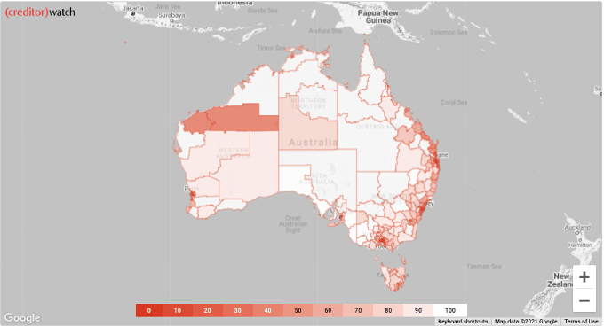
The lines in the maps are shape files2 that draw the SA33 regions of Australia. Such files can be found in ABS (Australian Bureau of Statistics) data. Even though the ABS shape files are very well detailed, they create a big problem: the dataset is way too big to be served in a timely manner over the network.
Currently, such maps are around 50MB, which will can be downloaded in a few seconds with a good connection, but can take a very long time if the website is visited on a 4G or 5G connection, for example. The first step we took to resolve this issue was to reduce the resolution of the map4 to be able to serve it very fast and make the map usable with any connection.
On an early version, we used Highcharts5 which allowed us to draw maps using geoJson format, but we quickly realised that the performance wasn’t acceptable for this use case. An alternative that worked very well was Google Maps with a Data Layer6 that depicted ABS’ SA3 map that we used to calculate its business risk index.
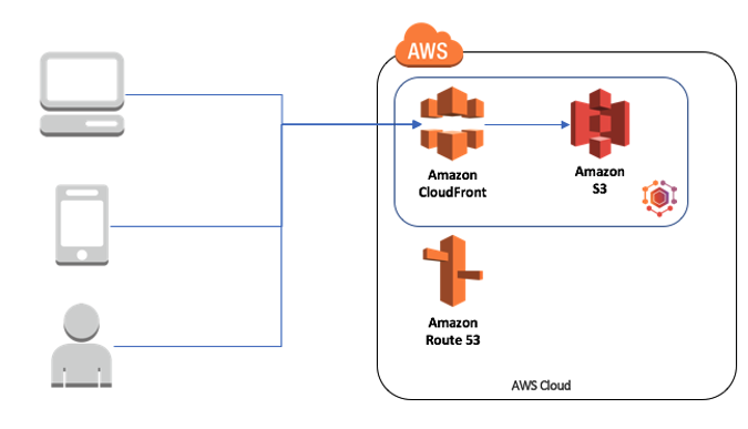
When the map tab is clicked, the map will be loaded from Google Maps and there is a request to download the resolution reduced SA3 geoJson map and the data (georisk information) that go into the map.
We do that serving using serverless technologies. Instead of hosting our own servers (containers or virtual servers), we use the mix of Cloudfront + S3 that provides security and seamless scale. This approach allows us to accommodate big peaks of traffic and not pay for low traffic periods.
Source: CreditorWatch
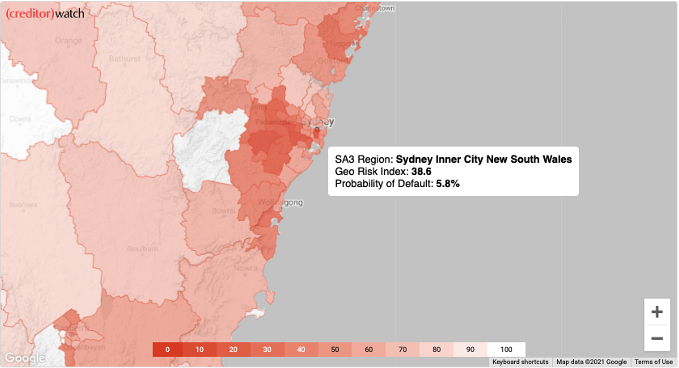
We visualised the Business Risk Index using a heat map, which is very common and intuitive. In this case, we can easily see that the riskiest areas are depicted with a more intense red colour. That convention makes the map easier to understand in terms of risk – no risk.
This approach allows us not only to depict which regions are riskier than others, but also identify clusters of regions that might have bigger credit risk. Such types of data helps not only credit providers, but also legislators to make better decisions and create policies that allow such areas to develop better and for actionable insights to be solidified.
The Business Risk Index goes a bit deeper than that, since it provides another dimension of data, which is the predicted probability of default of the region. Since adding a second map might have been a bit too much, we decided that the user should be able to interact with the one already created.
Source: CreditorWatch
With all the decisions described above and the use of a variety of data visualization tools , we can summarise around 400 billion datapoints into just 3,000 and show them in a very fast, engaging, interactive and scalable website that helps visualise the current credit risk of a country in just a few seconds.
The experience of designing and implementing the Business Risk Index has taken months of work from data scientists, software engineers, product owners and marketing people.
The result, though, has been extremely satisfying and the Business Risk Index has now had thousands of mentions in mainstream, specialist and social media, being praised as one of the most innovative projects of the year in the fintech space.
The people behind it couldn’t be prouder of what they have produced. Hopefully these articles inspire you to think big and provide you with some guidance on how to build gigantic data sources projects on your own. And if you do, please write about it and let us know, we’d be very excited to read about it.
Sources
[5] https://www.highcharts.com/
[6] https://developers.google.com/maps/documentation/javascript/datalayer